NWAS rebrand call receives our creative response
Serving over seven million people in times of medical need, North West Ambulance Service (NWAS) is a crucial arm of the region’s healthcare system.
They receive approximately 1.3 million 999 calls and respond to over a million emergency incidents each year across communities in Cumbria, Lancashire, Greater Manchester, Merseyside, Cheshire and Glossop (Derbyshire).
Its branding is iconic to generations but as an essential cog of a 21st century NHS and with a continued emphasis on its vision to be the best ambulance service in the UK, it was time to provide a little TLC.
As go-to marketing partners – having previously worked together on design, rebrands and award-winning creative marketing campaigns – we were approached to collaborate yet again with this inspirational organisation of emergency responders, patient transport providers and NHS 111 urgent care and advice givers.
We took the call and flicked on the marketing siren…
Reflecting the professionalism and pride of its service and people
NWAS’s much-loved family of cartoon characters – born and developed from the imagination of Sarah and Nicola in our creative team – played a pivotal role in two highly successful award-winning NWAS campaigns, ‘Star in a Car’ and ‘Make the Right Call’.
They won the public’s affection, individually helping to convince thousands of people to seek assistance appropriate to their health concern and to recruit an army of volunteer car drivers to transport patients to routine hospital appointments.
They were a highly appealing and integral part of developing a key campaign resonance and rapport with the public when it came to effecting behavioural change.
But NWAS’s branding in general required a refresh for a more contemporary look and feel.
It needed to reflect its highly skilled and professional service and workforce.
It also had to convey the unified importance of all its teams from Patient Transport Service personnel to marketing and communication teams and frontline paramedics and technicians.
Months before the rebrand it embarked on simplifying its core organisational values to represent the diversity of the different roles and functions under the NWAS umbrella.
‘Working together’, ‘Making a difference’ and ‘Being at our best’ emerged.
We created logos to represent each of these values consisting of boxed icons which could be used collaboratively or as individual elements.
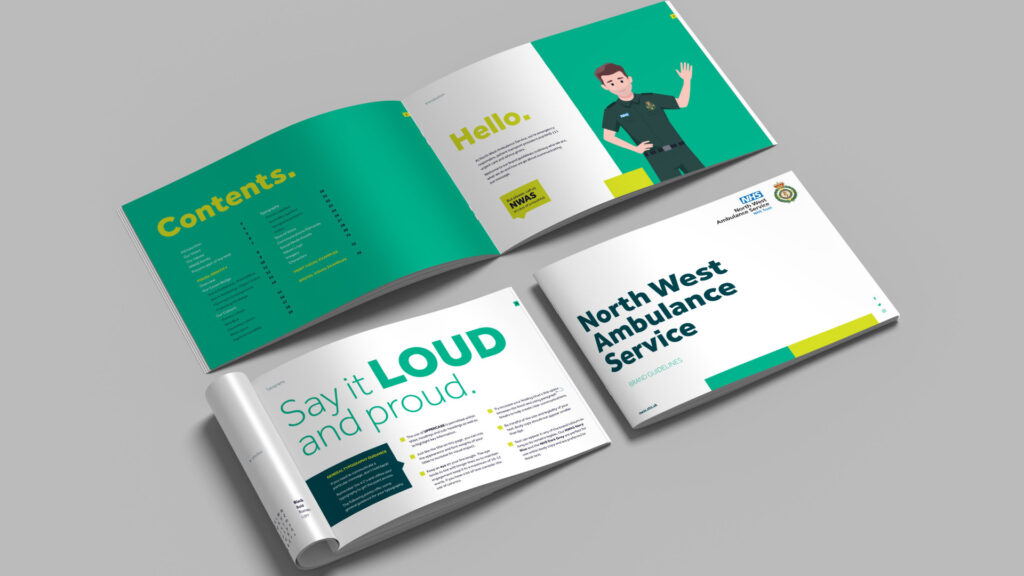
We developed new brand guidelines to shape and steer all internal and public facing comms across digital platforms and traditional channels such as print, point of sale and brochure and literature design, honing in on a sharper visual identity.
Based on a ‘4 C’ methodology of ‘clean, contemporary, clinical and colour’ we brought in strong typography and adopted an enlivened palette to sit alongside the traditional green and yellow tones of the ambulance livery and the iconic NHS blue.
NWAS’s Crown Badge and organisational logo is of course untouchable but we laid out its exacting procedures for use regarding sizing and positioning within the brand guidelines to emphasise its critical branding standards.
Pitching the right tone
Our copywriting team were tasked with creating a renewed tone of voice based on the shared values of the NHS and NWAS.
Key to this was NWAS’s organisational ethos of family; ‘While we are many, we are one. We are many people in many different roles, but we are bound together by a caring ethos which sets us apart.’
This is cemented by its ultimate commitment to place patients at the heart of everything it does and to provide care with respect, dignity, and compassion.
We worked together to establish characteristics, which conveyed the diversity of NWAS services, alongside the professionalism and pride of its staff.
Tones were developed to reflect the architect of innovation status NWAS holds within the healthcare system; they were the first service in the country to roll out the enhanced 111 service in 2020 and were instrumental in developing new procedures and process of critical incident management following the Manchester Arena attack.
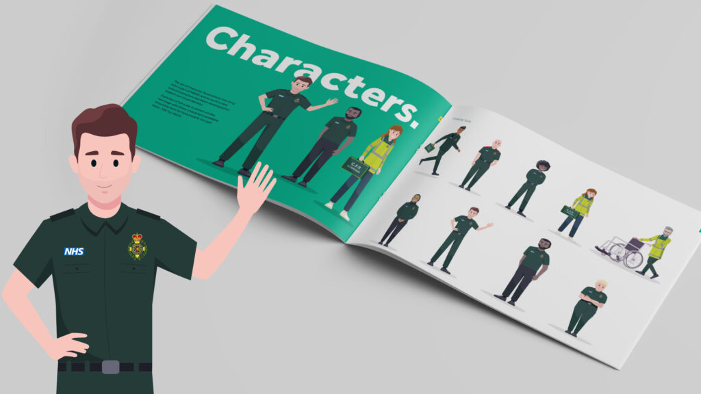
Make way for new faces!
It’s always sad to say goodbye to old friends – particularly when you’ve brought them to life! – but while the NWAS ‘Star in a Car and ‘Make the Right Call’ characters take a well-earned rest from their highly successful campaign appearances, our creatives have been working on the next generation.
The new characters depict the roles within NWAS and while they may have matured in the design stakes, they continue to reflect the friendly, caring ethos of the organisation and its people.
Ranging from their patient transport service to emergency operations centres, we’ve created a whole suite of team characters to support NWAS’s visual identity.
Rebrand roll out
NWAS has been gradually introducing the rebrand throughout its many comms internally, to stakeholders and the public via its newsletter ‘Your Call’, on stationary, reports, in-house messaging and campaigns both in print and digitally.
It’s also been adopted across its social media channels such as Facebook and Twitter, email bulletins and in this new era of virtual communications, across Teams backgrounds.
We’ve delivered numerous standout campaigns, rebrands and projects for our healthcare and public sector clients over the years including the NHS, Cancer Research UK (CRUK), The Christie Hospital, Manchester City Council and Greater Manchester Combined Authority.
As a full-service marketing agency incorporating creative, digital, PR, print production and signage we offer our areas of expertise under strategic partnerships and to compliment the skillsets of in-house teams.
We’re renowned for our strategic and creative approach to achieve efficient, engaging and results-driven outcomes.
To find out more email us at clients@cornerstonedm.co.uk
Keep up to date with our client work and latest industry insights by connecting with Cornerstone Design & Marketing on LinkedIn.